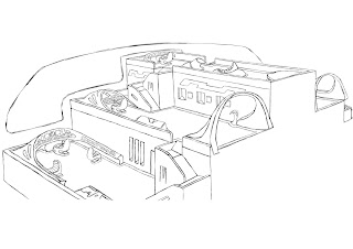
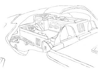
So i decided to go ahead and get the interiors sketched out but first i researched into what is in the room of the captain, the captains quarters. Looking at the images the room is either consisted of a work space or living area or sometimes both as the room consists of a desk, seating and the usual living appliances.
So from the research i went with the mixture of both living and work area as the room is very large and i use this to my advantage by placing the work space under the top floor where the bed, small desk, cabinets and wardrobe are.
But the lower portion consists of a large t.v, book cases, food compartments on the wall, a way to get from base floor to top floor, seating and the work area under the top floor.
Here is the image of the whereabouts of the ship, which is the top right corner at the back of the ship.
The next room interior is the cargo room and as you can see it is split into four areas the top floor being the small cargo areas and the bottom being the larger cargo holds, with the middle sections of both floors being the access points via corridors.
From within the room you can see various shapes which represent cargo of all sizes and how they are placed within these rooms is via the cargo doors on the floor of the rooms which small cargo would be picked up through the large doors, then through the small doors to be placed within the room.
 Here is the whereabouts of the cargo rooms, which is placed in the base of the ship allowing cargo to be picked up from and go right up into the rooms.
For my next interior i researched into control rooms and seating designs and from the images you realise a limited amount of colour as shading is utilised to form the outlook of the room.
The designs of the rooms are very slick, clean and show that sense smooth visuals which would be expected from advanced technology. The room itself consists of monitors, seating and technology based equipment.
For the seating i researched into unique designs because they seem like a way of the future, a design which would fit into a time period where designs are unknown. The shape of the seating fits within the surroundings it is placed within such as a smooth shaped chair would best suit a smooth looking room rather than a cube shaped room.
 So i used the research towards my design by creating a smooth clean looking design, using curves to shape aorund the room and with this look it gives a unique outlook throughout the rooms and a design which is unfamiliar. The room consists of two floors on each side, with the control panels, technology and food compartments are and the top floorwhich would be the captain's floor where he would command the crew, bellowing out instructions. The large rainbow like shapes are part of the entrances to the middle floors where as the base floor would utilise the corridoors.


No comments:
Post a Comment