Start of a Concept
 |
| Similar Work Research |
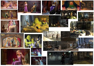
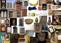
The game will be a 3rdperson, action adventure, obstacle game where the gamer plays a knight battling his way through a castle up to the highest tower to which a princess has been kept by an evil wizard and from the moment the gamer has found the princess the character control switches to the princess. From this moment the gamer plays as the princess and working her way towards the evil wizard to exact revenge. The game will be more of an obstacle game where you will be the knight working his way up to the tower to save the princess and then switch to the princess and work your way to the evil wizard. The platform that i am aiming at is console games and giving myself 100,000 polygons max for the room, the reason for this is because i feel that certain areas of the room may need a higher polycount because of the confined space and the close proximity of the gamer to an object that maybe getting away with detail through textures will be much harder but nonetheless that maximum number is not really a target but rather a number which i need to stay away from. The target audience that I am aiming for is the at the age range of 12+ as the game is an action adventure game consisting of puzzles to work your way to the next stage and because of this, the audience would be seen as a curious audience from the fact that they want to know what happens next and curious about certain objects within the game being a piece of something. With this project i stated to have concept art of an overview of the castle and the interior, floor plan and a 3D room modelled and textured and with the intentions of being aimed at an audience of 12+ so i started to look at similar pieces of work that resemble what i am trying to go for and also having slight inputs in terms of female touch to my level. I looked at the always dominant source of princesses that is Disney whom have a line-up of princesses from Mulan, Pocahontas, Tiana, Snow White, Rapunzel to Jasmine, Cinderella, Belle, Aurora, Ariel and also the Shrek franchises Fiona along with Xena and many others the reason being is that all of these women are shown as becoming or are courageous and in my own game the princess in seek for revenge finds that courage and i want to show that within the game room. Also as you can see in the research moodboard i looked at Elder Scrolls Oblivion and Skyrim as these are the level at which i would like to achieve for my own room as well as referencing their design of the room and how the textures are being used as well as the whole approach made by Bethesda Studios.
Story Summary:
The fairy tale princess story is set in a fantasy world and will be a new fairy tale introduced but following pretty much the clear outline of usual princess fairy tale stories in which a damsel in distress need saving by a knight and is within a medieval setting, in it’s own world time of 270 years with magic seen as the powerful force which resides in hidden areas of the land.
"An evil wizard has taken captive of a princess and locked her away in the highest tower of his castle and a brave knight is in search of a damsel in distress and hears about the story and goes in search and finds the castle that she is trapped within. So the knight battles his way to the top of the tower and saves the princess which is turns into the princess going for revenge against the evil wizard."
Room Components:
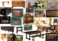
I started to break down the main objects and additional objects that would be within the room and from the basis of already outlining some of the key components usually associated with a female room such as the bed, wardrobe, draw and other items i decided to work from there. I began by researching medieval eras, finding that the era spanned many hundreds of years from the Norman Invasion of 1066 up to the Tudor dynasty of the 1500's during which time the architecture and living standards in the medieval castles changed considerably and with my own world being a fantasy setting i didn't want a complete resemblance to other castles but rather pieces from different times of medieval eras to contribute. Many of the rather wealthy castles had a large number of rooms or different purposes such as a wardrobe room, the great hall, bathroom, the Bower, throne room and so on and i felt that the castle that i am going for would benefit from being an abandoned wealthy castle which had multiple rooms allowing me to focus on the main princess room and not the additional bathing and cooking items. So i began to look at what objects would be within a medieval room and found that there were permanent fixture's such as built in cooking ovens, sinks, fireplaces, larders, cupboards, window seats, wall seats and built in Chapel furniture – choir stalls and also portable furniture that had to be moved to one castle to the next by wagons and these furniture’s were beds and pallets, stools, benches, trestle tables, folding chairs, chests, coffers (strongbox), buffets and wooden barrels used as baths. With that list fixtures and furniture's i really was able to choose what exactly i would have within my room so i chose the already mentioned objects with the bed, draw and wardrobe and added a few items such as a chest, fireplace and buffet table to not really over do the amount of objects within the room but also because a fireplace would be a good source of light within the room and also a mood setter, the buffet table would be the place where the food would be set and the chest would hold all the valuables of the princess. The reason why i didn't go with baths, cupboards, ovens and so on is because they would clutter the room up and i felt that this princess is being held captive and so wouldn't be trusted with a whole kitchen of items that she could use and would rather be taken to a another room within the castle to bathe and her food would be prepared, this way i am able to keep the room at a minimum.
Throughout the medieval era's the furniture's commonly used wood such as Oak, Ash, Elm, Poplar, Larch, Beech to make up the exterior of the objects and also Iron was the main metal that had been in use for most of the objects within the era such as braces for chests, weapons, shields, hinges and so on, so i found that going with this basic outline already will aid me as i feel the iron is lock in what type of textures to go for but i have a choice between the six types of wood mentioned. Also now knowing that i will be for a much wealthy setting for the castle i came across a bit of information which i feel will help to make the room much more of a higher class, wealthy aspect within the room without going throughout the castle, the Canopied or hung beds which were a symbol of the status and importance. The base of the bed being made of wooden frames with holes in them and ropes pulled through the holes in a criss-cross pattern which formed the base of the bed, with a mattress usually made of feathers and placed on top of the base. The bed canopy assembly consisted of a bed head, or tester, rising to a suspended frame, which was covered and draped in fabric and the bed would have sheets, quilts, fur coverlets, and pillows and with also the whole of the bed being enclosed by curtains, with the four-poster bed eventually becoming a requirement of every Medieval Lord. As i mentioned before that i would have a fireplace i looked into the fire places and found that fireplaces were a necessary feature of medieval castle building and chimneys were introduced replacing the central hearths with canopies and along with the central source of light i looked into what light sources would have been used with the medieval era. I found that there were four types of lighting methods used in the medieval era '
Rush Dips' which were tapers made out of the stalks of rushes which had been dipped in melted fat and then dried and then placed into a receptacle called a 'Nip', providing a weak light which lasted about half and hour. Candles which were home made from animal fat and placed in candle sticks that lasted longer than the rush dips, Torches which were used to light the interiors of large areas such as the Great Hall and finally Lanterns or 'lanthorns' which was a candle stuck into a metal frame with sides made of thin, transparent horns. From those four sources of light i feel that candles is the fairly obvious choice as it is a longer lasting source of light as well as being small and simple to quickly model and place within the scene of the room for additional light source. I had also come across more information that i feel could come in handy with the types of material used for the roof, Thatching were used for roofs but stone slates, tiling and plastered straw was introduced to reduce the risk of fire and this could be used for when the character is looking up at the roof of the interior of the room. Also i found that the glass windows were often painted with armorial designs however i felt that by introducing this to my room i would end up spending much more time on the windows pattern than the actual objects within the room and so decided to do without the designs and go for a much simpler design for the window and there was information about the floors within rooms which i found that there were limited number of Carpets and mats introduced to castle interiors but floors scattered with straw were still favoured and that sweet smelling herbs such as lavender, camomile, rose petals, daisies and fennel were added to disguise the bad smells of the castles which were predominant due to the plumbing systems but this feature i feel is not needed until smell - o - vision comes round but i could have a few herbs lying around.
 |
| Planning the Creative Development |
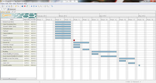
I focused my attention on more of the room rather than the character side of modelling and texturing and the reason is because of my other involvement in the Food Landmarks project in which i stated i would be handling the character side of the project, so i wisely chose to create the level within the FTP project to have a variation of work to look through and not only a level but a 3D level allowing the gamer to have a much wider visual objects, where as both of my other projects are 2D based games. The concept of creating a 3D game with the touch of a female aspect into the level is one that i feel adds to a variety of my previous pieces of work and the fact that this level will be confined within a room only furthers my capabilities and approach to the development of the room as i will be able to focus on more of the objects within the space rather than the actual overview of the space. Once i had the basics of what i wanted to create i started to plan the process of the creative stages and how long of time each stage should use and with the general outlook of what objects would be placed within the room i was able to better understand how long i would need to create and texture the items and have them within a working room in which the gamer can explore around but this project is rather to challenge myself to seeing what i am capable of achieving in a smaller work space and how i can create something at a high level within the short space of time allocated along with developing my skills so that they are demonstrated as an improvement through this environment. I carried on using Autodesk Maya and Unity because they are the two main software's that i have been using throughout my years at college and found that i wasn't at a stage of understanding as i should be particularly with texturing and what i could achieve within Unity if i actually used it much more than just placing assets within the scene and planting a 3rd person controller and also rather than starting a new piece of software it would make sense to carry on using what i have been and further exploring the tools as i mentioned i haven't fully grasped the capabilities and also there wasn't much of an available time to learn a new piece of software and to then show off my skill set through that particular piece of software and also using the already software that i have, i am able to pace myself much quicker if i am constantly using the software and thus making me work much faster to produce the next piece.
 |
| Moodboard |
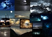
With the idea of the project set and the usage of time planned i knew the basic set up of the room and the objects that would make the room up but i started to make a visual moodboard on how i wanted the room and the concept art to look. So i began to grasp images of a much darker setting than my other final major projects and you can see the mood and style that i want to go for with the time of day being at night with the moon shining down across waves that are hitting the cliffs underneath the castle. The mood is a dark setting as the only light sources are from the moon, fireplace and candle so overall there isn't much light source so the gamer will be visually limited and also a little wary that something will happen within the night setting as everything else is peaceful. The overall setting of the environment is of the castle set on top of a cliff, with the time being at night and i also had thought of adding rain and lightning for added mood setter but thought that the main aspect is the interior of the room rather than the outside.
 |
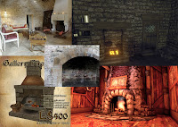
| Castle Research |
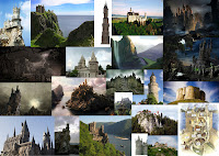
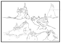
With the setting down and set, along with the mood i started to get a few images of what type of castle design i wanted and this time i wasn't restricted by the fact that i would have to create the whole of the castle and making me keep the design at a minimum but this time rather i would be able to create the castle design how i wanted it and also not spend too much time on the design as the main focus is really the room but the castle overview is rather a visual aid to see what surrounds the room. The main aspect of creating the castle was to include a large, high tower which will be inhabited by the princess so the under laying buildings could be designed however i wanted, so when looking at images i wanted a much more block approach to buildings and even of how a rounded or almost rounded building looks through a block layout rather than a curved layout of bricks. As you can see in the images i researched various designs of the layouts surrounding the area around the castle along with the general positioning of the highest points of the castle.
Castle Concept Art:
 |
| Quick Sketches |
I started off by designing some quick sketches, not really taking my time but laying the basic layout of buildings and just the general quick outline of the castle by doing 5 different designs to then chose one to further develop into the castle overview concept art piece. What i wanted to achieve in these basic designs is to vary the layout and overview of the castles so that they wouldn't resemble my previous castle but also stand out in the unique positioning and set up of the buildings to where there would be a knowing that the castle has been there for years for example with the rock formations forming around the castle as well as the the overview look like that the castle has been there whilst the water has corroded the land around the castle so that the castle has become secluded.
.jpg) |
| More Focused |
 |
| Finished Piece of Concept Art |
Once i had the general overview of the castle done and given myself options with five different designs i had chosen the first design that i had done the reason for this is because i felt it stood out more and fit with the general layout of a castle but also is one that stood out for it's use of positioning of buildings in a way that the main focus draws you into the highest tower where the princess is held captive and so i felt it was better than the others for catching the audiences attention. So from the chosen design i realised i could basically work on from the initial sketch and just tidy up a few areas with the concept art process by blocking in the colours to the general sketch and once that had been done add the contrast of the colour to add depth to the buildings. Once i had that done i basically added the lighting and the mood of the overview of the concept art by adding a light source in the top left corner in the form of a white moon so i have an indication of a light source and from there on added a dark shade to most of the right side of the scene but also to the cliff to make rock formations from the light source but i also added a light white shade to the side of the scene that the light source is on to add a much brighter shade to the colour of say the castle to show the moonlight shining on the castle. Then after i had done that i started to add bits of detail such as windows, shape of the buildings and just making the castle have areas separated rather than blend into one huge castle and then i finally just touched up the scene by adding an atmospheric fog to set a sort of fantasy, hidden visual to the castle that this is a mysterious place that has been left abandoned but is still inhabited by someone. Along with the fog i tried to get the overall visual of the castle to be seen as a faint piece of concept art one which doesn't have certain areas sticking out such as a dark black outline of the castle or even a block of colour not really in contrast to the rest of the image and that's what i tried to clear up but once i had complete the overview piece of concept art as you can see in the image on the left i felt that the amount of space in left side of the image is just wasted and my intention is the focus of the castle and so i trimmed down the image to rather focus in on the castle and that's where i was left with as shown in the image on the right.
Room Interior Concept Art:
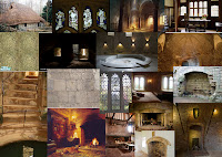 |
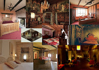
| Interior of Castle Rooms Research |
 |
| Medieval Bedrooms Research |
The next step after having the overview of the castle done was to start doing the interior concept art and i began by researching interior of castle rooms to see what images i could found that could be useful interiors of the architectural structure and placement of windows and doors and i really got a sense of understanding of what the interior of castles are typically like and also of what they try to achieve in the sense that they try to draw you into one focal point of the room which i feel will be a beneficial find for my room. Another piece of research that i had gone into was to find the typical medieval bedroom interiors such as how they have the beds, the draws, the wardrobes layed out and even the colour scheme which a consistent colour of red is used and one that i understand is a symbol of royalty or wealth as this particular colour is connected to a high priced piece of fabric. Also from the bedrooms i found that the beds take up much of the space of the and why wouldn't they they are after all the largest objects that would be in a medieval room as it used by a full length human and because of the bed being the largest object within the room it draws the attention of anyone who enters the room to immediately look at the bed and also the room itself isn't very large in height and which i feel fits nicely and looks cosy.
 |
| Interior Room Layout Designs |
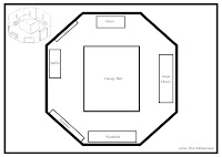 |
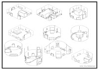
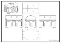
| Rough Floor Plan |
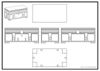
I began the designs of the interior of the room as i had done with the castle designs but this time with the designs i had done many more designs for the room but rather focusing on the layout of the essential objects that i had mentioned previously with the now canopy bed, chest, large draw, buffet table, wardrobe and fireplace. I started off with a basic 3D square outline so i would have a cutaway interior layout so then i could see the height and the rough scale of some the objects but most of the designs that i had done where essentially using the square, circle and an octagon shape which were similar shapes to the concept art overview of the tower so i felt that having a varied design off of these shapes would help. Throughout most of the varied designs i was basically laying the identified objects into places rather than going into detail of the chest design because if i had done that then i would have spent days on this which wasn't needed but rather once i had a clear cut design that i wanted i took that design aka the fourth design and made a basic floor plan to clearly demonstrate the positioning of the objects. Rather than going straight into designing the concept art piece of the interior i started to do further visual research into the already mentioned objects to fully embrace the designs that have done and how i can perhaps implement or be influenced by them and develop my own designs for items such as the chest or wardrobe and etc.
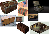 |
| Chest Research |
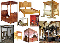 |
| Canopy Bed Research |
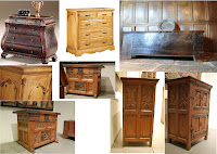 |
| Wardrobe Research |
 |
Large Draw &
Buffet Table Research |
 |
| Fireplace Research |
These are all the research images i had done for the objects that i have already mentioned and the reason i had researched for the individual objects was to see the designs that were out there and how i would benefit from having certain shapes as well as the additional stuff added to the objects which is evident in a chest design with the braces or the canopy bed with the curtains.
 |
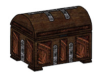
| Stages of Chest Development |
 |
| Chest Turnaround |
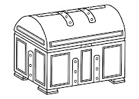
So i began to develop my design for the chest by creating variations in the shape of the chest lid which i wasn't sure if i should keep it as the rest of castle design as in square, blocked design so i tried to develop different designs for the lid as well as different placement of the braces. It was at this time i was shown the reality of my pacing when i was spending long amounts of time on just these rough designs when i should be knocking out each design quicker than the last and in the end i decided to go with just the five designs and take one design further as it should be demonstrated in the image to the left where i had chosen the design i felt would fit the setting of the castle and took that design one step further but implementing variation, just the four quick variations and landed upon my chosen favourite design which was down to the simplicity of the design and because of the design also being symmetrical which i felt would benefit in the modelling process as it shouldn't take long to model and even texture.
 |
| Chest Texture Test |
 |
| Chest Cleaned Up Design |
After the chosen design was well, chosen i cleaned the design to make it more clearer and refined and then did a quick texture test as demonstrated in the images of the cleaned image to the left and the texture test to the right. With the texture test i basically used the images that i had researched and did an early test with those images by taking pieces and covering the chest in that piece of the researched image to see how the textured would be used upon the chest and i felt confident after seeing this because the textures cover the chest nicely to where the chest doesn't look bland because when i was designing the chest i felt like i should add an extra brace of another panel to cover up large areas of the chest that would look plain but through the texture test i was able to see that once the texture is one the chest it shouldn't look plain but rather look wooden. So with the chest design, chosen and refined i began to do the turnaround of the chest which was simple enough but in previous turnarounds a constant issue that popped up had been the proportions of the object and also the fact that there was no top view so this time i started to create the turnaround of the chest using the rulers within Photoshop to keep the proportions right and i created the turnaround with each view at a large scale to then once all views, including the top and bottom were done i would select all the layers and scale them down to a size where i could place all views onto one layer and this is shown in the image above on the right labelled chest turnaround.
 |
| Large Draw Cleaned Up |
 |
| Large Draw Turnaround |
 |
| Large Draw Texture Test |
As you can see above i basically followed the same route in developing the design of the large draw asset in which i felt it would be best to keep the same initial design involved with each object and so i introduced the braces into the design of the large draw but this would only come in the sides and the front and back of the large draw. The follow through of the initial design from the chest design left me with nothing new to add to the large draw design besides a lock mechanism, different scale of panels and a flat top surface so i really was just able to work off of the chest design and rearrange a few areas. Once i had done that i had the cleaned up version of the large draw and once again did a texture test to see if some of the scale of the panels would be able to show carvings and i found there was some issue but i had been able to resolve that by expanding the size of the panels by a small length and then was left to do the turnaround and as i said before i was able to work off of the chest design and this was the same case for the turnaround layout.
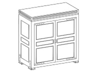 |
| Wardrobe Cleaned Up |
 |
| Wardrobe Turnaround |
 |
| Wardrobe Texture Test |
Once again i was able to reuse the previous design of the large draw in this case as it was a more flat surface design and take apart to rebuild the wardrobe that i was going for which wasn't difficult of a choice in the design process as i mentioned before i wanted the consistency of the general design to come across on all objects. The way i did that in the wardrobe design was much different as there is the involvement of the doors of the wardrobe so the braces were limited to the back and sides of the wardrobes but smaller braces would be applied to the design to the doors of the wardrobe for the hinges. Other than the variation of the braces, expanding the large draw design to incorporate the size of the wardrobe and the addition of the handles to the wardrobe there wasn't much of a significant development and that wasn't in laziness but in the thought process of saving time to reuse assets and designs and work from or revamp them to be used as another object which carries the development process further but also keeps the objects relevant to one another because they have the same style of design to signal the same time of creation and setting.
 |
| Buffet Table Cleaned Up |
 |
| Buffet Table Turnaround |
 |
| Buffet Table Texture Test |
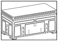
Now with the buffet table although it looks like there is a different approach to the design the initial concept from the previous assets still carry on and through the buffet table as you can see the braces have been removed, the panels and layout of the buffet table have taken the design from the large draw and there is the additional four posts which provide a shelf to the buffet table. The reason i had done this design was to show that the buffet table would have two tiers the top being the main food such as fruit, porridge, bread and the bottom would have the water or wine stored underneath and also to show a different take on an object and still be able to carry on the designs that have been set out through other objects. So once the design of the buffet table had been done i had done a cleaned up version which i then did a texture test to see how it would look because of the layout and the scale of certain areas i wasn't sure if the table would have been significant to the other objects which were larger in scale and showed off areas such as the panels and the carvings but once i layed on the textures from the researched images i was surprised at how well the buffet table looked because of the two tier shelf it brought a refreshment to the typical block objects that i had done and varied the designs perspective on a different object. Once i was happy with that i was able to reuse the previous objects turnaround and add the uniqueness of the buffet tables design which was quite simple in itself as the buffet table was symmetrical and had no additional pieces which is seen as the easiest of objects to model.
 |
| Canopy Bed Turnaround |
 |
| Canopy Bed Cleaned Up |
 |
| Canopy Bed Texture Test |
This design was the one that i wasn't clear on how i should approach it as i felt like i should have the four posts solid beams or similar to the shape of the actual room as a octagon but it wasn't until the design of the buffet table that i realised that going with a cylinder shape for the post would be better as it worked so clearly with the buffet table and would be another piece of design that transitions onto another object so there would be consistency of designs throughout all the objects which at that point i went ahead and used the buffet table design and set it out as the scale of the canopy to which as soon as i was done i knew that this is the way i should go with the canopy bed design. So since i had used the buffet table design for the canopy bed i had only needed to make some readjustments, add a frame to the top of the bed and have a headboard i was pretty happy with the end result as there wasn't much of my time used up on developing the canopy bed but rather improving on the buffet table which saved time on developing from scratch. Once i had the design set i had cleaned the design up to make it ready for the texture test and no this is where i had to additional work such as adding the curtains, bedding and pillows to get the general texture and look of the canopy bed right compared to before that where the bed would have just looked too similar to the buffet table and at the end after the texture test i was pretty happy with the texture that i had chosen as they made the canopy bed feel like it was meant to be for a female person because there were those elements of smooth areas of wood. After i was happy with the texture test i was ready to get on with the turnaround of the bed and since i had already reused the buffet table design i felt that i could get away with reusing the turnaround of the buffet table so at the end an additional amount of time had been saved along with a design i was happy to start doing a model of.
 |
| Rough Cutaway of the Room |
Now that i had the designs of near enough all of my objects apart from the fireplace which i felt that i knew the design i was going with and it wasn't much of needed turnaround and variation so i wouldn't need to do a visual design but just start modelling the fireplace. The design of the fireplace that i have gone for is similar to some of the assets which is that they are block shaped and the fireplace would be similar, as it would a rectangle shaped fireplace with a shelf on top and a chimney to follow, the front of the fireplace will have a semi circle shape cut out to which the fire will be. So going back to having all of the objects besides the fireplace designs done i had taken the turnarounds of each assets and placed them within a cutaway of the room to see the general take of the positioning of assets as well as the space available for the character to move around and after a while of scaling some other assets down i was able to have a rough cutaway done which i was happy with and could work off of and the reason i didn't further develop the cutaway had been because time constraints limited me to adding more development which wasn't needed for the hand in so i decided not to take it further although i would have liked to have it done to measure up with the end product.
 |
| Floor Plan Cleaned Up |
 |
| Floor Plan Texture Test |
 |
| Floor Plan Base Colours |
Now that i had the general placement of the objects set within the cutaway i was able to understand the space that was needed for the character to move so when it came to the floor plan, which was one of my hand ins i started off by working off of the rough floor plan that i had done early on and started to add the top views of the objects that i had done from the turnarounds of each object and started to develop additional stuff such as a cloth, bowl and fruit on top of the buffet table, a candle on the large draw and as well as the introduction of the fireplace which will be the main source of light and also the position of both the door and windows. At the end i had a clear cut layout of all of the objects and the designs from above done so i labelled the objects and was ready to clean the layout up so that it looks clear as you can see from the first image above to which i then took further by introducing basic colours and light shade for depth and i feel the colours that i had used don't clash against each other but are significant enough to separate areas and objects. Once i had the design layout and blocked colour of the floor plan done i basically carried on with a texture test by adding light textures to the objects to get a better understanding of what the objects would be which came out pretty nicely.
 |
| Concept Art 01 Block Colour |
 |
| Concept Art 03 Block Colour |
 |
| Concept Art 02 Block Colour |
With most of the assets covered and the layout of the room set and positions cemented within the room i was ready to create the interior concept art and before i had started i went into to Maya and basically layed out a block of the length and height of each object within the room identify the scale and depth within the view point of the concept art. So using those Maya screenshots for the general scale and perspective vanishing points i was able to use that to start creating the concept art and this is where i feel i am still at an amateur stage so i began by having three different view points to which i started to develop a quick block of colour within each scene of the viewpoint and then after i had done that rather than start the next process of development i rather took a liking to the first piece of concept art as it was a simple view which shows a more lived in touch with the addition of the bowl of fruit, lit candle, wine glass and bowl of porridge. I also enjoyed the fact that i could block out colour for different perspectives which turned out quite well in the fact that you are able to see some other elements of the room through just the block of colours which are nice piece of illustration in itself which i wanted to show through my process of development as it is nice, clean and clear on what it shows. But i had chosen to develop the first colour block of view and from that block of colour i started to add a contrast to each individual base colour to add depth to objects such as the bowl or the bedding and this really added more of a realistic visual when it comes to a 3D presence where if you see a round object because of the light and dark shade you know its round and that was basically what i had set out to do in the scene for each area of the art piece. Once i had done that i was ready to add the overall lighting and shadowing i started with the knowledge that my main source of light is coming from the bottom right of the scene where the fireplace is so basically from there on i made the rest of the scene look darker from the bottom right to the top left corner as the depth of the room goes further so does the range of light and i also added shadows coming from the canopy bed across the chest and the left wall as well as the base of the fruit bowl and the curtains and bedding bu also added a light orange tint to some of the areas of the right side of the scene to show the fire light shining or visibly showing the fire source. Also because i have a candle within the scene i had to pay attention to the limits of lighting and shading when working around the candle and to overcome that i had made much of the area around the candle flame source so that it seemed like the darkness is visible up until the point you get closer to the candle flame and to finish off the whole of the scene i noticed that there wasn't much with the walls and when i tried to add some contrast of cracks or bricks it just didn't go with the overall image until i started to play around with the texture settings and the opacity of the textures so that they're not in your face but go along with the scene within the backdrop to be left with the final image shown below and at the end of the day this is where i came up to and when i looked back i actually started the whole of the interior concept art process the same day and along with producing the basic colour outline pieces i was more than happy of what i had produced as this was the first time i had done a piece of concept art within a day and to me it felt like i made a huge step forward with the pacing of my work as well as not losing quality when speeding up.
 |
| Interior Concept Art |
Making the Level
 |
| Room Assets Modelled |
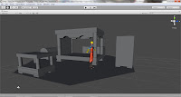
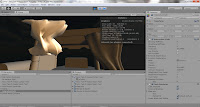
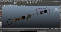
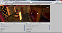
Once the visual process was complete and i had the designs of assets and overall layout as well as the mood of the room set through the concept art, i was ready to start implementing the designs within Maya. With the use of the turnarounds for each individual assets i was able to quickly produce the shape of the objects and that's how i began modelling the room by using the individual assets' turnarounds to be used as image planes and then from there i basically modelled a corner of each asset as they were pretty much symmetrical on the x and z axis which made the process much quicker and freed up more time and also i went ahead and modelled the assets first rather than the room as stated in the Gantt Project time line because i felt that working out the scale of assets would be beneficial first rather than doing the whole of the room and then having to change the assets. With the quick production of the five main objects that i stated would encompass the main aspect of the room and with some time available i started to take each individual asset, after mirroring geometry to become a full asset, i placed them within one scene and positioned them in place of the floor plan along with working out the initial scale of the assets. Once i had done that i thought that since i still had a little more time, that i could take the room as it is right now and bring it into Unity so that i can actually go through the tools that Unity offer because in previous uses of Unity i just placed my level into Unity and not really used Unity's tools, so here was my chance. I exported the room at it's current stage into and FBX file format and created a new Unity project along with inserting the FBX file into the project folder and just started to go through the available tools Unity offers.
 |
| Scale Representation |
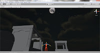 |
| Moonshine Skybox |
 |
| Starry Night Skybox |
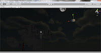
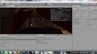
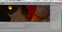
The first thing that i had found was the 3rd person controller that Unity offers and i thought that this would be a great opportunity to test the scale of my assets which i found that there were a few that needed readjusting so i went back and solved that problem. So now that i have a much clearer scale of assets i started to try out the available skyboxes from Unity and found two which best suited the situation and timing that i had set within the planning phase of the project. The first skybox that i felt was one which favoured the setting of nightfall and added that mysterious touch due to the darkness which benefited the project when you were within the room to focus within the room and not the outside although there is the sky to look at. The second skybox was another image for the surroundings that i felt could work as well as it wasn't as dark as the previous skybox and there is a showing of a source of light which would help in presenting another light source through the windows to add different contrasts as well as shadow angles.
 |
| Flame Light Source |
 |
| Moon Lighting Test |
 |
| Fire or Flame |
I carried on doing more tests within Unity such as the light source from the skybox moon but wasn't able to get the lighting distance correct and it wasn't until afterwards that i realised that the same problem i would have later is the reason why the lighting was so off and it was because of the positioning of the objects within the scene weren't at zero so the calculations of lighting and other tools would be off. But after knowing i couldn't get the lighting to work at that time, i carried on and looked at the particle system within Unity as this was Unity 3.4 and so i thought there would be new upgrades made i found two different types of fires one which was labelled fire particles the other flame particles. So i began by taking a look at both particle systems and just setting the particles to represent a fire burning within a fireplace as the smoke goes up and whilst i was comparing both results i started to realise that the fire, visually looked too realistic, something which i didn't want to fall under contrast of the rest of the room which i wasn't confident would look realistic as the fire but closer to the flame particles which represented a fire burning but not in a realistic visual manner.
 |
| Cloth Testing |
 |
| Sparkle Particles |
 |
| Waterfall Particles |
Carrying on with my exploration of particles i had found a particle labelled sparkle which once selected and viewed i felt there was a possibility of actually using this particle system as my room is intended to be an obstacle where the female and male characters are barricaded within the room and need a means for escape to which they need to find items to get out of the windows of the room and climb down and using the sparkles to highlight those items could be a means to use the particle system as well as add a new piece to look at. The next particle system i looked at was the water systems which i had not seen in the previous version of Unity and was intrigued by the actions as the one i was mainly looking at was the waterfall particles as i stated in a pre-visualisation of the overview that it was raining and so felt that i could possibly lower the velocity of the waterfall as well as the size and the emission of particles to have a leak or water trickle down one of the walls. The final tool that i really wanted to take a look at was the cloth system within Unity as i had heard of what it was capable of and felt the need to try it for myself for future designs to use the cloth system and so with this project i remembered that the canopy bed would have curtains and so i tried the cloth default meshes to see the use and functions but wasn't able to clearly evaluate how to use the cloth system. So i went back into Maya and created a quick basic cloth with a few edges and exported the asset to Unity and as shown in the above third image i figured out how to use the cloth system by attaching the mesh of the curtain to the cloth system. However the constant problem that had occurred was the fact that the cloth would collapse and this was down to the gravity within Unity and the fact that the cloth wasn't pinned to the position i wanted it to be but i was told that if i really wanted the curtains to move i should add a joint chain and animate the curtain but i later realised that this would end up being unnecessary as the curtains would have no means to move unless the gamer knocks into it which won't happen as the bed restricts the gamer to reaching the curtains, so instead i was able to figure for next time the use of the cloth system so i will be prepared.
Texturing:
 |
| Beech Render Test |
 |
| Choices of Wood |
Once my available time was up with trying some of the unknown tools within Unity i was ready to continue with the the modelling process which only needed the fireplace doing and once i had followed the same procedure of modelling as i did with some of the other assets i began the UV mapping process which in this case was simple and easy to do as the objects were pretty much needing to be planar mapped as they were flat surfaces and because they were near enough symmetrical it was much simple to focus on one of the corners to UV map and then once mirrored the textures would apply to all sides so it sped up the process a little more.
 |
| Oak Render Test |
 |
| Elm Render Test |
 |
| Larch Render Test |
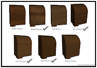
The whole of the UV mapping process was finished and i was ready to begin texturing the wooden assets first as i felt once i have a chosen wood type then it would be easy enough to use the same texture but make a difference for each asset so from the list of wood types found in the research i narrowed it down to four that i was happy to test. So began by finding some photo references for the wood textures and applied each texture to the chest and my findings were that every texture looked clean and i think that is partly because i really didn't add nothing to the textures but block colouring and manipulated the photo references to shop up the wood carvings but all the textures had looked clean and nice and didn't really have that medieval tough, old, worn out wood feel and this is shown through the render shots that i produced which above, show the three textures which i felt were good but didn't encompass the look i was looking for. It was however the Beech render test shown above right that i found as close as the chosen textures could get and i felt that is a basis where i can start from, so i carried on with adding the remaining bits of design such as the braces which shown below in the first image i felt didn't come off right within the texture process.
.jpeg) |
| Braces Texture Version |
 |
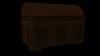
| Complete Chest |
 |
| Brace Modellled Version |
 |
| Carvings Research |
The problem being with the braces being textured was the depth and the fact that they faded into the texture of the chest which i didn't feel went right but rather having individual low poly modelled braces would be much better and beneficial to have as they can be reused for the other objects that take the braces and also because it fits with the positioning and depth that i had in mind for the design when first created. So the braces were done the base texture of the chest was added and now i just needed the carvings within the panels of the chest and so i first started to develop a design by simply taking the space of the panels of the chest and producing designs that i fit the setting of a medieval era and through the research of carvings really see what type of designs fit that era and how i could show that through my work. I did a few designs which weren't getting the right design of a medieval image that would be on the furniture so i looked more closely at the carvings from the research and i found that they were more fluid in the design using curves, with the designs really going into each other or breaking apart so i started to produce something similar in my own way and as you can see in the brace modelled version image i place the carvings upon the chest to see how it would compare visually upon the chest and it wasn't until a few trys that i found the right design to lead me to the final image where i feel like the carvings fit in with the medieval setting that i am trying to portray.
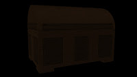
 |
| Fireplace Texture Problem |
So once i had the initial look of all the wooden objects from the chest to the wardrobe to the large draw and so on because i wanted a consistency of texture throughout similar objects i was able to transfer over the process to create the chests texture to each other asset and following the process of working on the area that is able to be mirrored, which also sped up the production to focusing onto the fireplace. The fireplace when it came to texturing, i wanted to match the room and really become embedded within the wall but to also stand out a little on it's own so i started to texture the fireplace and when i did do that i realised that the chimney would need to be split up into two UV components as i was working with the UV map that i had already produced, in that UV map i had simply selected the majority of the chimney and UV mapped that area and when i was texturing the chimney and viewing the texture on the model the whole of the image looked blurred and messed up in places. It wasn't until i went into the UV texture editor that i realised that i will have to break the chimney into two sections to allow myself to have a bit more of freedom on the texture to maintain the quality.
 |
| Additional Research |
.jpeg) |
| Door Textured |
Once i had the main objects of the room done i started to focus on the actual room itself and i had already modelled the walls and door as well as the windows which were simple cube polygons manipulated to be the height and width of my designs, with the models UV mapped as well. With all of these objects already UV mapped i was ready to texture them and before i did that i wanted to do some further research and really see the common factors and designs throughout these objects as well as additional objects i could have within the room, So i looked at windows, doors, bowl of fruit, the bedding for the canopy bed, carpets, chalice, bucket of water, jugs, mirror, combs, female clothing and more and i used the windows and door research specifically at this moment for the designs that i wanted. For the door i simply went with a rough wooden door using a different Beech texture to the one used for the wooden assets and applied rusty braces as the hinges of the door as well as a door handle but for the window i liked the design of a criss cross stone window and went with that design but i did have an issue of applying way too many faces to the polygon to get that design. Instead i tried the way of texturing a criss cross stone on the window which turned out okay and then once i added the rest of a seamless stone texture to the whole of the window the end result was one which i was happy with as i had the texture file export out to a PNG file format so that the areas with no texture would be transparent and allow the audience to see through the window to the skybox, once into Unity.
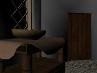 |
| Bowl of Fruit & Cloth |
 |
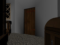
| Room Textured |
Once i had the door and windows textured done i started to texture the largest areas of the room with a basic brick layered texture for the floor and really just added a contrasting shade of grey to really be a visual base rather to allow the viewer to focus on the assets and objects within the level rather than the floor but i got the texture of the floor to be at a point where it is sufficient enough to be placed underneath the camera and pass off as a brick layered floor in a medieval setting. Then i started to think that the room needed to look like it was lived in as this was one of many issues with my previous castle project and so from the research that i had done, i added a bowl of fruit to the room by modelling a quick bowl and low poly fruits and adding simple textures to them and then did something similar with the canopy bed by adding a mattress, bedding, pillows and curtains with rope tying them back to the rooms bed with a quick texture on them and it started to make the room look more lived in with the messed up bedding and the cosy bedding with curtains for the bed. Once that was done i quickly focused my attention back on the walls of the room and started to add a different texture to them than the floor texture where it was a more flawless layer of bricks but with the wall texture i wanted something different. This is where i found a texture which i felt made the room much medieval where the bricks were rather large stones placed upon each other to form the wall and that is what i like about the walls because they carried a similar colour contrast to the floor where they fit into the backdrop of the overall visual room but the walls differ from their style. I also added a more lighter shade around the door and windows part of the walls to add that the windows and door are placed within the wall and new bricks and stones were placed around the window and door to support the wall. After completing the walls and the floor i zoomed to find that i forgot to plan for the roof of the tower and so basically just had a side of a triangle, which i UV mapped after setting it to the scale of the room and then mirrored it to form the whole shape of the room so that when i texture the roof the texture will apply to all sides of the roof. Also i created a cube which i stretched to the size of the roof and then duplicated it after UV mapping the first stretched cube so i have beam supports for the roof and once all of the beams were in place i added the texture of both the roofs and beams which were base colours with textures of roof tiles and wood for the beams and in understanding of the textures to the duplicate beams i took each individual beam and rotated it or positioned them to not look similar to other beams.
 |
| Curtains Normals Problem |
 |
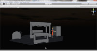
| Lighting the Room |
The next step after having most of the objects done was to bring them into Unity and get the positioning right as well as the lighting and shadowing. The positioning of the room was pretty simple as i was able to maintain the positioning of the assets from Maya into Unity with also being able to move each individual object. So with tha issue not needing much attention i focused now onto the lighting of the room and as i mentioned before the main source of light would come from the fireplace and the Unity tool that i would use to do this would be the flame particle system and because i had previously played around with the settings i was able to use that flame particle system and just place it into the fireplace but as soon as i had done that there was an issue with the smoke as you could see it going up the chimney because it was coming through the fireplace model, so i had to go into the settings of the smoke as well as make sure the same issue wasn't happening to the inner and outer cores and make the fire just go up without being seen other than the inner fireplace.
 |
| Curtains Further Problem |
 |
| Canopy Bed Normals Problem |
Other issues arose once i inserted a controller to enter the room when i noticed that when you look at the canopy beds curtains from across the bed they go missing and so i understood that this was due to the normals not being reversed as the curtains were created from a plane polygone mesh and i also noticed that there were a few of the curtains ends being a little bit back into the bedding which would be seen coming through the curtain and is something which i would just move the ends of the curtains further away from the bedding. There were also additional problems such as the canopy beds corners which needed the faces reversing and were easily solved but also the textures were issues which were brought up such as the floor which was heavily textured and needed to be scaled up and the walls textures needed fixing as they were blurry and also heavily textured when up close and were easily solved.
 |
| Painting for the Room |
 |
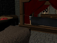
| Additional Assets |
So i had started to create more assets to make the room more feminine and lived in as well as resolving the previously mentioned problems. I knew what i needed to create as i had done research for additional objects for the room so i took some of those objects and started as shown in the image to the left. I created a mirror to show that a femal person would need a mirror to do their hair or get dressed, a carpet to add more of a difference to a generic room, bucket of water, brush, jug, chalice, bowl of porridge, fireplace object, drapes for the room and paintings. All of these items i believe will help to set apart ths room to any other generic room and also showcase that the resident of the room is a female and once i had completed them i simply placed the items within the maya file and in posisition to then export the whole file to Unity in the right position along with all the additional data. With the paintings however i used a photo refrence of a cliffside and just took that image into Photoshop and used the filter settings to manipulate the image into looking like a painting and the reason i had done this was because i would have placed my own paintings but i had no time to produce any new ones as well as my concept art pieces werne't of a painting level but i did place the overview into a painting frame with the filter settings of the cliffside image.
 |
| Updated Walls and Floor Textures |
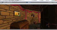 |
| Paintings within the Room |
Another issue that was brought up was that the room is intended to look like a female princesses room and yet the room that i have made so far just looks like a generic medieval room, now at this point i completely forgot about the female touch as i was so wrapped up in having the best looking individual assets as well as having a few items to seem lived in that i forgot about the princesses touch to the room. With the additional objects i was able to make the room much more feminine as well as individual to other medieval rooms and with the floor and wall textures once i tried to update the texture i was using to where i wanted them at the textures became worse so i had to go back and get different textures, ones which looking back at now i feel are in a better position as the floor texture is one which i am very happy with as it is more spacious in the brick layers and just fits in with the whole of the rooms brick layers. The walls textures i had redone with a much more clear formations of the bricks and cement inbetween the bricks and they look more detailed then previously however the issue of a blurred image still looks like it is around and needs to be fixed so i will try to do that now. Also with the bricks surrounding the door and windows i replaced the texture and rather created a low poly brick which i placed above the door and windows and also underneath the windows which at the end, ended up better than the textured version as this waytheir is more of separation between the wall and windows and shows each objects cut off points to where they don't actually blend into each other. At the end i was able to get the room finished and tweaked the lighting and shadow settings to a comfortable setting as feedback was received about the lighting being too dark behing the canopy bed and so i had improved the lighting where there is enough light to see in areas but not too bright and also just touched up the end product of the room to be ready for the hand in, however at the end i had to rush to get the work finished something i wish i can rectify in the future as i do feel that problem was because of the workload rather than leaving it too late as i have been working on all projects all day, everyday of the week whilst saying that if i get most of the work done early on then wouldn't have the stress of a deadline but those words came back to bite me because at the end of the hand in i now see that if i hadn't done the work outside of the 9-5 hours of a real job then i wouldn't have gotten all the work done and the end product to where i wanted it even though they aren't at the stage i wanted they are sufficient enough for me to look back at the time spent and be happy.
Conclusion
This project was designed to develop my skill set within Autodesk Maya and Unity and to also work within a set given time thus becoming more accustomed to a much quicker pace. I had chosen to reproduce a medieval environment setting similar to a previous project however this time the focus was on a single room, the reason for this was down to myself wanting to rectify that mistake by demonstrating what I am really capable of.
Throughout the duration of the project I was able to learn many new things within Autodesk Maya I was able better understand the management of poly count by relying textures to aid in areas of a model. The simpler the model the better the UV mapping became but the one area that had let me down before had been the texturing of assets and this is where I was able to learn that the texture has to not be too heavily bumped. Unity had become by far most source of knowledge as I learned much more from the capabilities of Unity compared to previous uses where I had only brought in the model and inserted a controller. But with the Fairy Tale Princess project I was able use the various tools that Unity provides creating a better and much viable environment with the inclusion of a flame, lighting, elements, along with many other tools to place the finishing touches to my environment. Another aspect I learned was to bring an element of the story into the environment and not become generic or repetitive so that it stands out in it's own way to get a sense of the story or character or scene from the environment.
The creative process of modelling a designed chest or even texturing that chest to add a sense of realism to the model and then to finally place that chest within an environment to fully enjoy the space of the chest are what I enjoyed about this project. Building an environment from design to implementation and bringing it to life in Unity is what I enjoyed about the project because you get to further develop an idea into multiple stages and view a different perspective of a 2D design made into a 3D model and to then allow yourself to interact with the model. This project is one of my favourites as you can see from the end result it is the best piece of work I have done with the use of Autodesk Maya and Unity and I’m very proud of that as well as my skill development progressing to where I will be able to create something much quickly and quality will be at a high.
With all the great aspects of this project there had been instances where I didn't really want to carry on because of something I didn't like. Instances where deadline was fast approaching and where I felt I was at was good enough for the hand in and to get me a better grade than a pass, don't get me wrong I knew that my project could do with much more improving but once It was known that the project wasn't where it was expected to be I was unsatisfied at the prospect of more work piling on because of the three projects running simultaneously. Which brings me to the fact that I had multiple projects running side by side which brought along the occasional additional work that needed to be done which took my focus away from my individual project. Also I really put way too much time into this and the other projects, as mentioned to me this working timetable would not be a real world scenario so I believe I really put a lot of my time into these multiple briefs which perhaps suffered in the long run because I wasn't able refresh myself and really relax or even get inspiration from trying out a new piece of software.
If I could go back and redo the project again, the first thing I would perhaps change is the amount of projects going on, which as I mentioned before affected the focus of this project and took away time spent to a project which received twice as much attention before this project had even started. Another change that would need to be made is the planning as I feel the time spent on doing certain processes such as the unity aspect wasn't really covered across the planned duration which was perhaps the unknowing capabilities that Unity had. I would change my approach to planning the project as I feel that because I had not really used Autodesk Maya for such a long time that I had rushed into modelling a basic layout of an idea such as the chest, wardrobe, canopy bed, large draw and buffet table and not really thought of what small pieces of the puzzle could make up this room which let me down as I had to really do some of the objects into a time which could have been used to further play around in Unity.
Overall the aspirations of this project were met I was able to reach the expectations I had set at the start of the project by modelling and texturing a room to a higher quality than any of my previous work. But also the length of which this project had been done within surprised me because looking at the end product I would have thought that it had been done over a period of a few months but through this project I was able to better manage my time to where I spend no longer than a day on concept art and even better manage my project. The path and the goals that I set myself were reached at the end of the project because I believe that it's not really the end product but the process of getting their that will help the next project.


.jpg)


.jpeg)


.jpeg)


No comments:
Post a Comment